[ad_1]
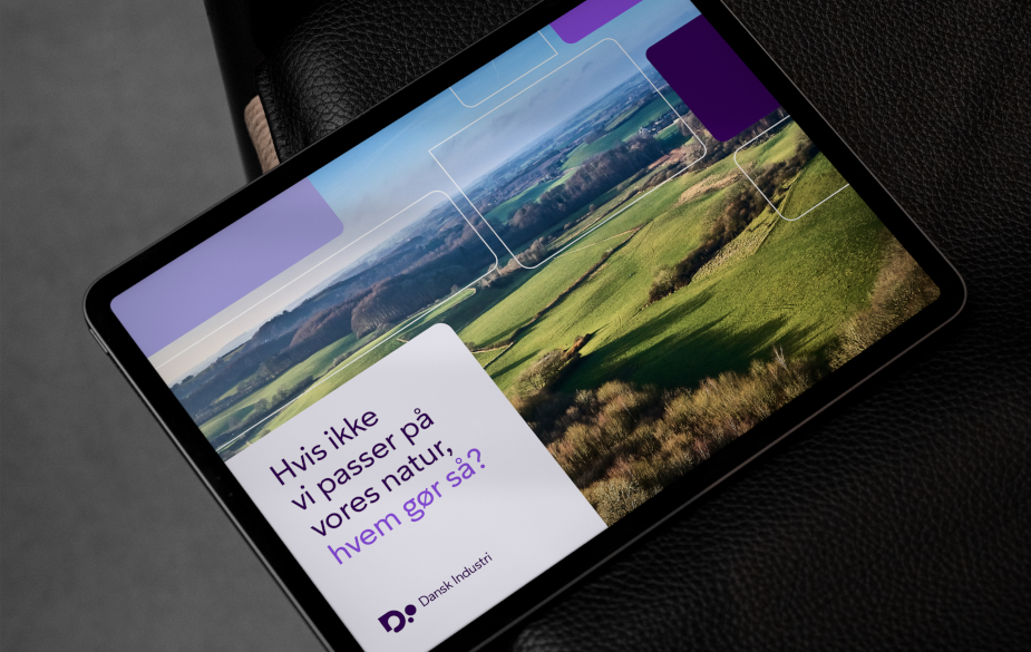
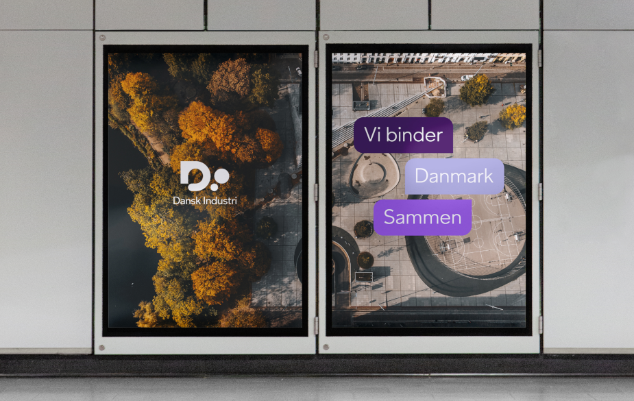
When redesigning the entire visual identity for The Confederation of Danish Industry (DI), design agency Bold Scandinavia didn’t just create something that is visually pleasing. They wanted to visualise the new brand strategy that thoroughly manifests DI’s market position. All made possible by an explorative and collaborative design approach.
The challenge posed to creative director, Christian Langballe, and his team at design agency Bold Scandinavia, was to create a strong and cohesive perception of Dansk Industri (DI) across expressions, organisation, and communication, both externally and internally. The new visual identity was going to part of an extensive rebranding of DI – an institution within Danish business.
”The need for businesses to play a more active role in the Danish society has arguably never been greater than it is right now. At DI, we have increasingly sought precisely that position, both politically and strategically. Now it’s time for our communication to do the same, so that we clearly convey the value of our members’ businesses to society,” says Morten Høyer, director of communications and Public Affairs in DI.

The main DI brand had to be strengthened and prominently featured in everything DI does. The design should unite the organisation and DI’s 20,000 member companies, showcasing a community filled with dynamism and creativity: A community where the result is greater than the sum of its parts. A community where differences fuel relevant solutions. A breeding ground for synergy.
Design as a Strategic Business Tool
Redesigning the visual identity of DI was a matter of creating something bigger than just a great design.
The brand and design team at DI had high expectations and ambitions for the new design – seeing the design as an important and strategic brand and business tool. Not just in terms of the aesthetics, but also strategically and in its level of simplicity of use.
Through a very close and collaborative partnership with DI and their in-house design team, Bold Scandinavia was able to delve into the inner workings and complexity of DI. This made way for change processes and internal alignment taking precedence over purely visual output.

“The end result is an example of what collaboration can create. We brought together our brightest minds from both client and agency to find an unexpected solution, that naturally fits the strategy and ambitions of DI on the behalf of our members. Together we have developed a visual identity system that with its sharp edges and round shapes reflects both small and large businesses’ role and connection to society,” says Didrik A. Fjeldstad, director of brand and marketing in DI.
“It’s been about shaping a culture before shaping a design. We’ve had the opportunity to collaborate with DI’s design team, which has provided valuable insights into their reality. Together, we have created a design strategy collaboration and a solution that DI can easily carry forward. It hasn’t been a handover; it has been a co-creation,” explains Louise Ørbjerg, client director at Bold Scandinavia.

As a result, the design of DI has undergone a visual transition from a universe driven by information and rationality to one that allows for communication, creativity, abstraction, and interpretation.
A transition Christian Langballe applauds, ”Considering DI’s size, position, and work, this is a rarely seen and significant step in a company’s design process. Kudos to DI for having the courage and ability to take it.”
“The result is not design for design’s sake or merely aesthetically pleasing. It is genuinely rooted in reality and can help DI become who they want to be, based on who they are,” he adds.
[ad_2]
Source link
